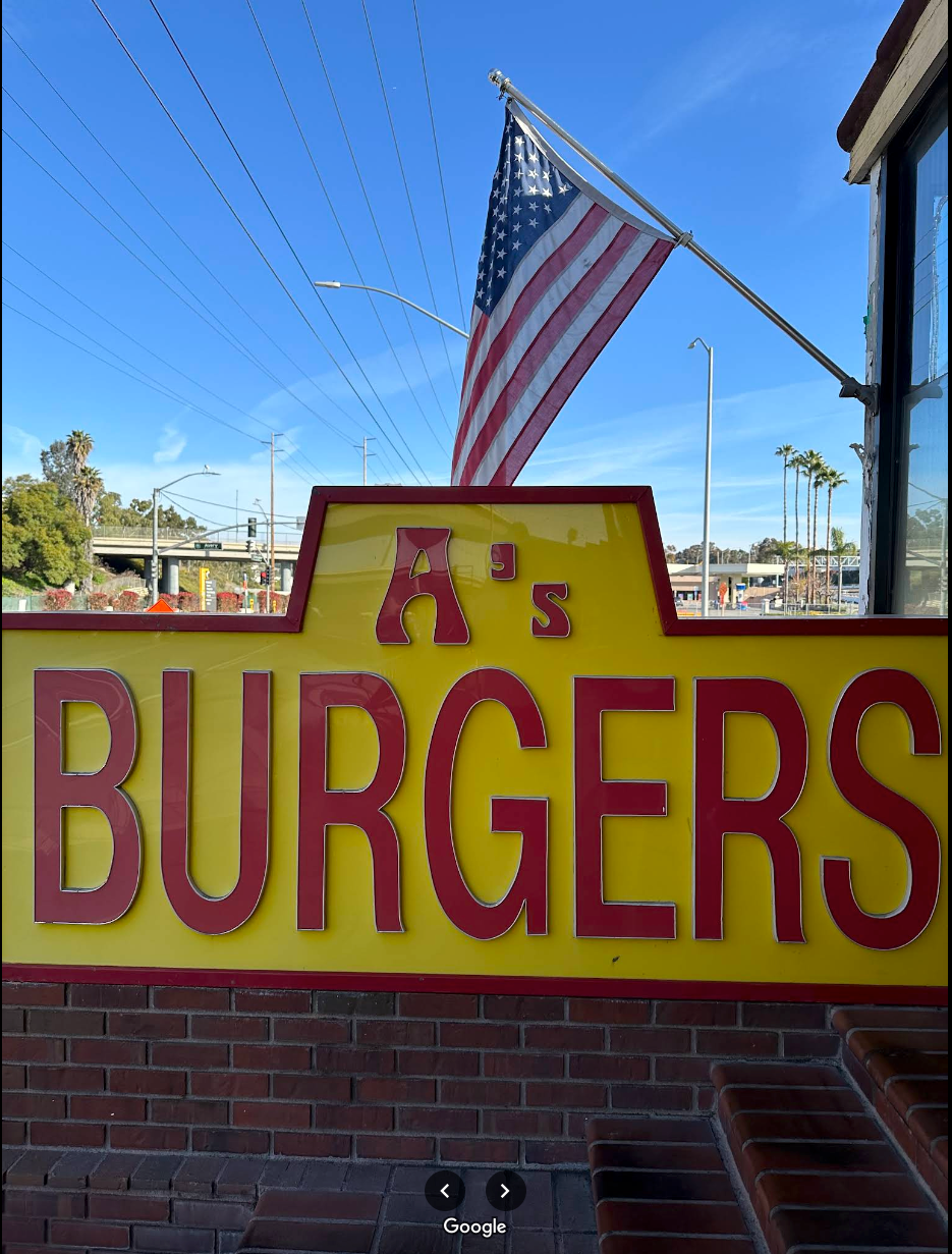
A's Burgers current logo
The current logo for this local charbroiled burger joint is a bit dated and lacks personality. Passing this burger joint every day on my way home, I finally decided to put my own twist on it.
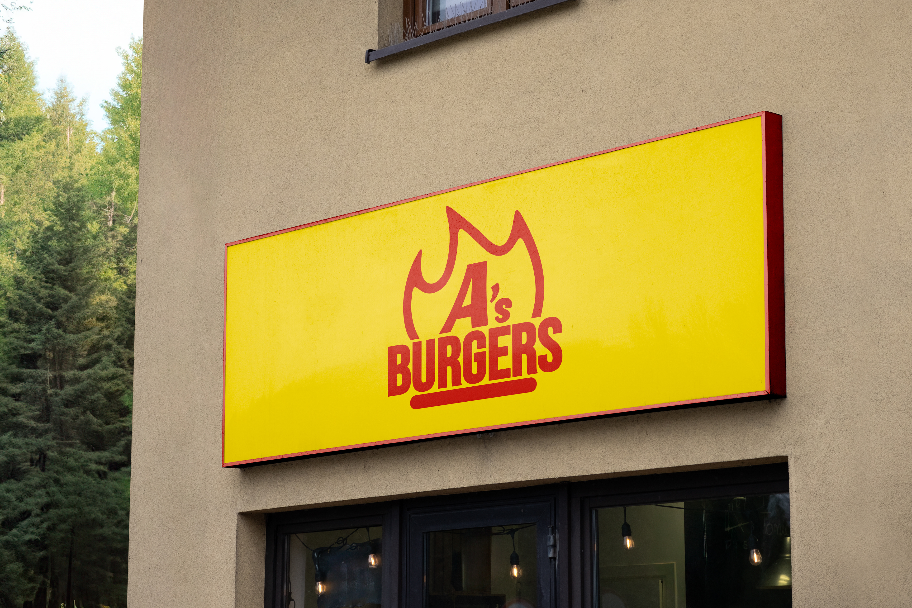
A's Burgers logo redesign
As I sketched concepts for how I wanted to redesign the logo, I had to keep one thing in mind: the importance of the letter "A." That letter has always had the most personality in the current logo. There is also something iconic and authentic about local businesses that have maintained the same (poor) branding for most of its lifetime.
With that in mind, I knew I had to keep the letter "A" front and center to preserve that spirit. While attempting to maintain the personality that letter has, the font I landed on keeps the "A" dynamic and inviting.
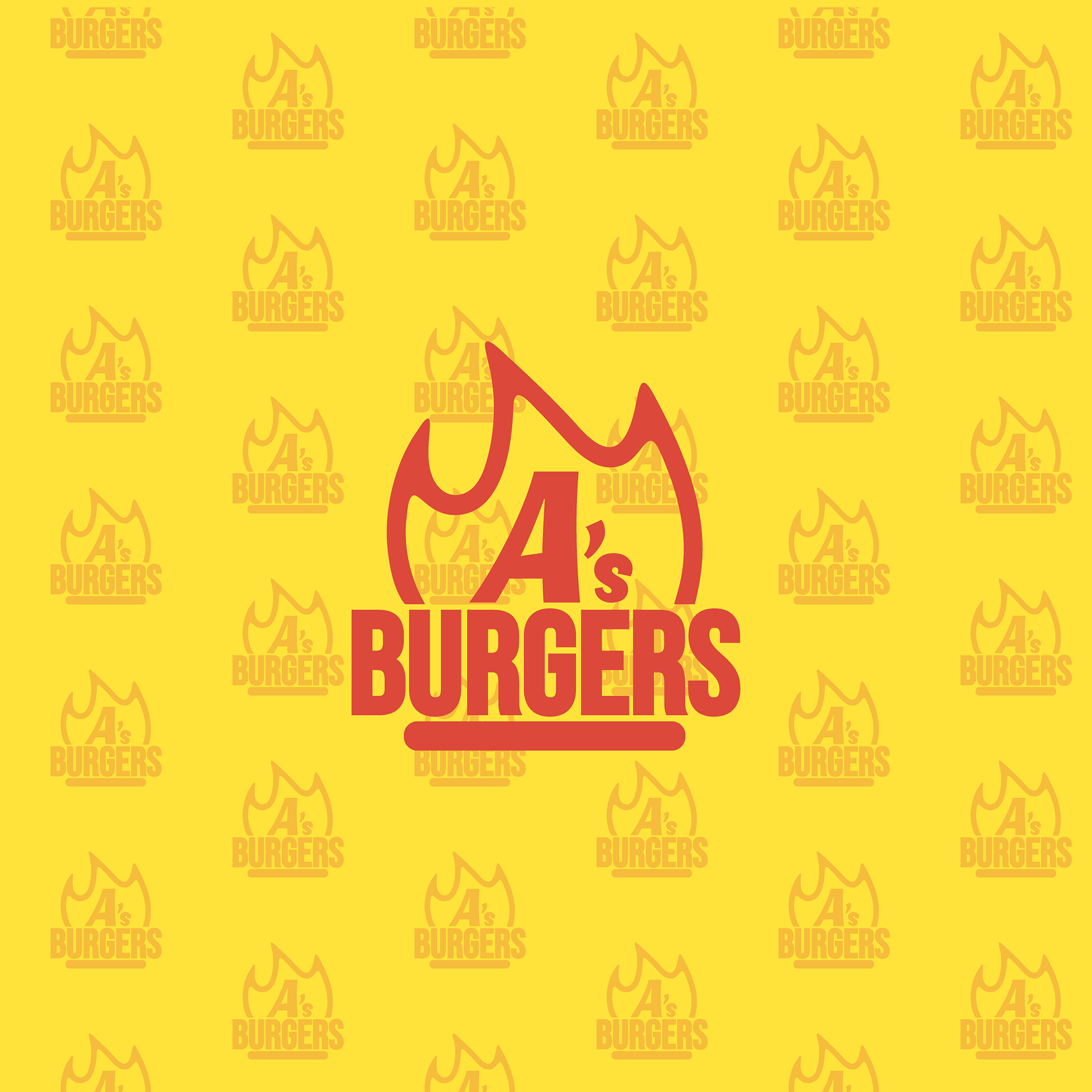
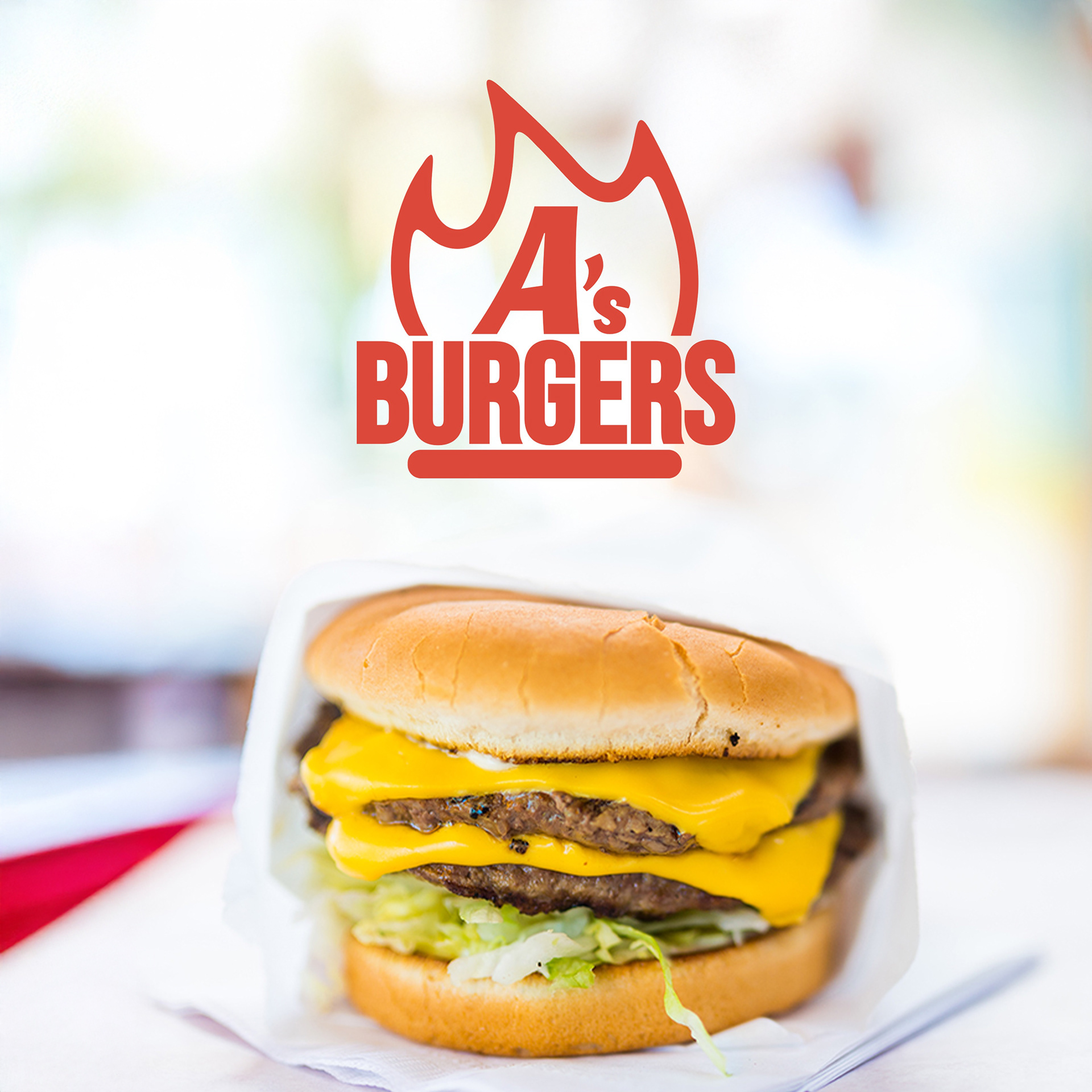
The icon
Being that the burger joint attracts a range of people - from youthful surfers to blue-collar workers on their lunch break, I aimed to create a distinct icon that was bold and dynamic. As a fast-food restaurant, the energy of people coming and going had to be matched.
The flame not only represents speed and energy, but also simply the fact that their delicious burgers are charbroiled. The patty and the flame work together to frame the wordmark.